Ecommerce Web Design for Your Store: Tips and Advice
Nowadays, if you sell stuff, whether sneakers or clothes, you need to get on e-commerce sites. These sites offer you the ability to build your company brand, contact more consumers, and sell more products.
Web design is crucial to building an e-commerce site. Successful ecommerce website design is all about using the right colors, fonts, images, words, and graphics to tempt visitors to buy. An effective ecommerce web page should attract potential customers, provide the best user experience, and showcase your professional store’s full worth. And that’s the way it should be.
In other words, you need to make your site look good and your branding strong, and also ensure that visitors take action and buy your products. How exactly can you do this? How do you create a custom ecommerce website design that makes products fly off the virtual shelves?
What Was Before E-commerce?
Let’s compare the virtual world to better appreciate the value of ecommerce website design and development.
When Apple opened its first store in the early 2000s, it revolutionized the way we as consumers shop. This was made possible by two significant improvements to the shopping experience.
Apple’s stores looked good. Even if you don’t plan to buy anything, their bright color palette, open layout, and sleek design make them places you want to be (although you may not want to be in them over time).
Every trip to a shopping mall should now include a stopover. They added several new features to enhance the user experience, such as the Genius Bar, convenient product testing areas, and a staff of tech-savvy employees who are always on hand. It was a whole new experience.
If providing customers with an exceptional shopping experience is now crucial to the success of brick-and-mortar stores, the same is true in the digital realm. Perhaps even more so, given that users can quickly stop using the internet after a bad experience.
As 2023 draws to a close, international revenue reaches over $6 trillion; however, by the end of 2026, it is projected to reach $8.148 trillion and $6.9 trillion. Transactions currently made online are anticipated to increase to 25% by 2027.
Your e-commerce store should be used to attract customers. The successful completion of this task depends heavily on the website design.
Starting Point at Your Business
Selecting a platform on which to build your online eCommerce store is essential, regardless of your ideas for business – dressing shop, salad bar, or anything else in between.
An eCommerce platform is an online program that gives you great design flexibility when creating the best websites. Furthermore, these web-based systems allow for numerous integrations, which are beneficial when managing your small business.
The software offers a sophisticated toolkit and eCommerce designs as a Service platform like Shopify. Create a page in a few hours with one of the many gorgeous, functional, and modern Shopify themes. Because SaaS tools are hassle-free, most users prefer them. Open-source platforms need to be implemented by a coder and a designer, in contrast to SaaS platforms.
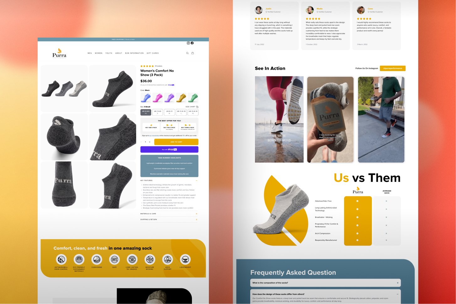
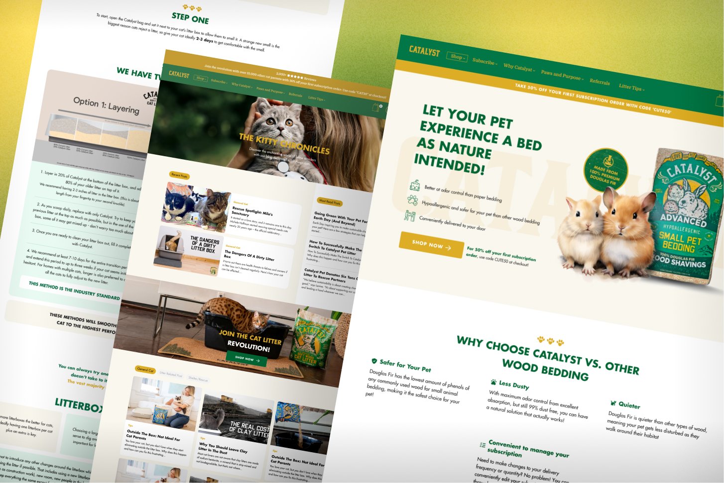
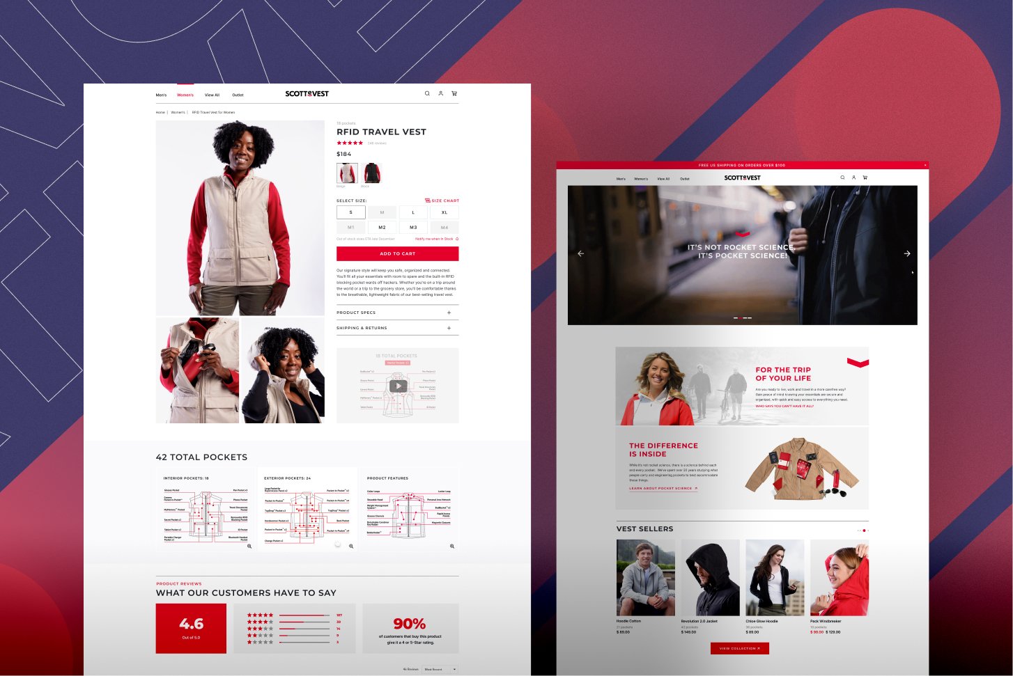
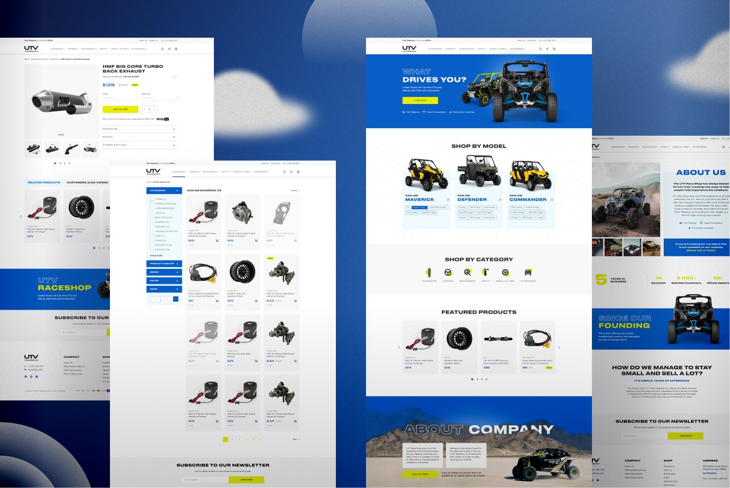
Paspartoo can create a new theme from scratch or modify your current one. Thanks to our experience, we can implement best practices in the following areas: selecting and configuring Shopify themes, accelerating a website, and configuring the theme.
You can create stunning and distinctive websites with all essential eCommerce features pre-installed. Now, let’s examine the main design components that require attention.
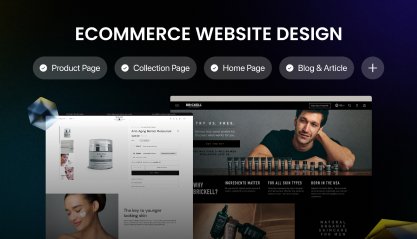
The Homepage Design First Impression
The homepage is your first opportunity to make a good impression, so don’t waste it. This is where you pitch your brand to potential customers. In just a few short moments, these new visitors ought to grasp the essentials of your company.
Nevertheless, you also want to avoid rapidly sending them into a product frenzy. To be more specific, here’s the general guideline: don’t turn your homepage into a product listing.
What, then, ought to be on your homepage?
Keeping things off of your homepage is crucial. It all comes down to striking the correct balance between showcasing your goods, providing accurate product descriptions, and building brand consistency.
At the very top of the page, users expect to find:
- A logo: It’s always clickable so that users can immediately jump back to the homepage from any other one, even checkout.
- A menu: It’s usually a strip with several category names. Don’t hide these titles under a generic one like “Shop” or “All”, as they tell nothing about the assortment.
- A search feature: If your buyers use search often, the rule is simple: the more prominent it is, the better.
- The wish list, account, and cart icons: Accessing them from any page is convenient for customers.
- Links to services include order tracking, store locators, help centers, and a language and country selector.
- The banners: The banners directly beneath the header are designed to draw visitors in just a few seconds after they arrive at the homepage. These striking images point viewers to the primary categories or tell about a recent sale or new drop.
- The USP bar: The term USP, or unique selling proposition, refers to features that make a business stand out. It can be included in a separate block if there is more to say. Alternatively, you can list the USP in the benefit bar.
- The products and categories: Parts of the catalog are displayed on the homepage, which serves two purposes: it informs users about the range of products and moves them from the interest stage to higher stages of the sales funnel.
- Individual items to feature:
- Best Selling goods.
- New items.
- Items with discounts and promotional offers.
- Recently viewed products.
- Products that are suggested (based on past purchases, wish lists, and browsing histories of customers).
- Newsletter subscription block.
- Competitive advantages or offers.
Shopify Ecommerce Website Design Considerations
Experts advise that the following eight crucial pages have the most significant impact on an ecommerce website development and conversion rate:
- Homepage.
- Webpage “About”.
- Collection page.
- Product page.
- Cart Page and Side Cart.
- Checkout page.
- Contacts, FAQs.
In addition, it is important that a user-friendly B2B eCommerce website design loads quickly and attracts the target audience.
1. Make sure your brand’s color scheme is consistent.
Your website must be consistent with its colors and fonts, regardless of the product category. This color will appear not only on websites but also in emails, confirmation slips, social media profiles, web design templates, landing pages, and advertising.
When constructing other design elements, it is imperative to have a clearly defined color scheme. Choose a color that attracts and expedites conversions based on your target market, offerings, and value proposition.
2. Maintain a sleek design.
Your eCommerce store must have a well-designed website with an easy-to-follow purchase path and web templates. If customers have to search for information, they will leave your website right away.
3. Streamline the process of viewing and filtering product categories.
Your website’s main focus is its product categories. Customers should have no trouble browsing and filtering through the product categories you offer while they do online shopping.
Providing categories and filtering options reduces the time customers spend browsing and gives them quick access to the products of their choice rather than forcing them to scroll up and down.
You must place your product categories in an easily navigable manner when creating an affordable ecommerce website design.
4. Emphasize the ‘View Cart’ button.
A tiny cart icon will appear on each page of an eCommerce website, usually in the upper right corner. It enables users to view the quantity of goods in their cart. This component is crucial to the overall design of any eCommerce website.
Conversion rates are increased when this button is visible on all pages during the browsing experience. Frequently, people add products to their carts and then walk away without checking out.
They may have forgotten about it by the time they log in again. Users are prompted to finish the transaction a second time by this tiny icon that appears along with the list of items in the cart.
Adding an icon that is simple to understand is crucial. Standard “shopping cart” icons are found on most websites. Intricate icons can confuse your customers, which you want to avoid.
5. Use high-quality images.
The long-standing complaint of your users—not being able to view the products before they buy—is resolved when you have high-quality product photos on your website.
Customers can purchase an item in person at an offline store after viewing it. Even though a product cannot be held in one’s hands while shopping online, excellent pictures of the product taken from all sides can improve the experience.
Top-notch photos are essential. Your products could appear inexpensive if your images are grainy or pixelated. Therefore, set aside a prominent area on your website design to showcase your goods with high-quality photos to produce an eye-catching gallery.
Design Advice for Ecommerce Websites to Attract More Visitors
-
Make it responsive for mobile devices.
Many people will be using their phones to scroll through your website. If your page isn’t optimized for mobile devices, you will immediately lose that customer base and integration with potential purchasers.
Paspartoo provides original website development and design services. Design that is both creative and practical for your company or marketing initiative. Our specialty is this:
- Business concept UX prototyping.
- The Shopify theme’s user interface was created.
- Promotional products for ad campaigns.
- Photo retouching and editing.
2. Place your best-selling items in the forefront.
Your store ought to feature your best-selling items. This could refer to the products that generate the most revenue for you, the ones that sell the most, or the ones that consumers give the best ratings.
To promote these top selling products, highlight them with contrasting colors, resize and rearrange images, and create banners. If you can divert customers’ attention from other products to the best product you want to promote, sales will increase. This can be likened to constructing a showcase around a standout item or positioning it at eye level on a physical store shelf.
3. Make use of a Newsletter Popup.
Many prosperous e-commerce websites use an instant pop-up sign-up sheet. Is it beneficial for remarketing? Remarketing is crucial since some viewers only conduct exploratory searches to weigh their options and check for availability and cost.
Once you have the prospective buyer’s email address, you can contact them again when they have had time to think about their options. A simple email at the right moment can help them make a choice in favor of your store. Just ensure you’re offering something in return if you ask for their address immediately; otherwise, they’ll probably close the pop-up and move on.
4. Prioritize your branding.
When purchasing goods online, whether expensive or cheap, consumers prefer to deal with reputable brands rather than anonymous e-commerce sites that look like a front for credit card theft.
Your branding needs to be carefully considered if you want to establish the credibility necessary to generate significant sales for your online shop. Branding is the essence of an e-commerce company, defining who you are as a brand, what you stand for and how you differentiate yourself from the competition. It is essential for connecting with customers and increasing revenue.
Take the time to establish your brand, then incorporate it into your ecommerce website design services. It’s acceptable not to know who your brand is; you should conduct some introspection before you begin designing. Pose yourself queries such as these.
- Who would I choose as my brand’s persona?
- What three words would you use to sum up my brand?
- What distinguishes my brand from other online stores?
- What makes our product superior to that of competitors?
Knowing who you are will help you incorporate it into your ecommerce site’s branding. Furthermore, your audience will grow to trust your branding, resulting in significant sales growth.
5. Consider yourself a website visitor.
You must consider your audience if you want the design of your e-commerce website to resonate with them. In the end, there are only a few things that your potential customers look for in an online store: a well-designed, user-friendly website that makes the purchasing process simple, uncomplicated, and easy.
Consider your visitor’s perspective when designing. What layout will be the simplest for them to use? How to arrange products so that customers can easily find what they need? How to make the checkout process less complicated?
If you think like your customers, you’ll be able to anticipate their needs for your eCommerce store and create a site that meets them.
6. It’s all about simplicity.
As a business owner and affiliate marketer, your goal is to simplify the procedure for your clients. Finding the appropriate category shouldn’t require viewers to look for buttons or delve too far. Drop-down menus, for example, make things simpler and maintain your website’s organized, uncluttered appearance.
Look at your favorite competitors and other e-commerce sites and see how they structure their content. Unless you have a compelling reason to do otherwise, it’s usually a good idea to model your shop according to industry standards so that users are aware of what to expect and how to use your website.
Customer completion and sales attempts are increased when purchasing is made simple for them. Amazon is an example of an online retailer that uses a straightforward tactic to boost sales. Customers can easily and quickly complete their purchase with their “one-click buy” option.
7. Employ readable content.
Optimizing your website for search engines is another aspect of maintaining simplicity. Customers want to avoid wasting too much time figuring out how to navigate your store. All they want to do is enter, browse, buy, and leave.
Use large headers to make the various sections of your store obvious. If different product categories are offered, users should be able to browse the site and find a category that interests them. Another method to accomplish this is to employ different header sizes, bulleted or numbered lists, short paragraphs, and images.
8. Think about the user.
The user is the most crucial factor to keep in mind at all times. Make the greatest shopping experience possible to entice customers to return. Customizing your store to appeal to them is one of the quickest ways to develop brand loyalty and win over new customers for life.
This can refer to the ease of purchase, the quality of the product descriptions, the use of a seamless interface, and the consideration of color scheme. By engaging with customers through surveys, social media, and other organizations, you can get honest feedback on what they like best.
Customers will only take a short time to realize how much effort went into making their experience optimal. Make a good impression by completing this step correctly.
9. Tell the truth about the cost.
It will be more effective on your e-commerce website than lying and trickery. Customers want to see transparent pricing to prepare themselves for the checkout process. Although shipping and checkout will not be calculated until the end, you should avoid additional costs. If the price exceeds the anticipated, a potential customer will leave your store and visit your competitor’s.
Design of the Checkout and Shopping Cart
Select the option that best suits your particular use case: full page, centering modal, or sliding in from the side. It’s crucial that opening the cart doesn’t interrupt the shopping experience. It should be simple to quickly check what’s in the cart and return to shopping if necessary.
If the cart is empty: It would be a loss of opportunity to write that it is merely empty. Encourage customers to add items with a call to action or instructions for shopping. You may even suggest products.
When products are added to the cart, users should be able to see these components in an easy-to-understand format easily:
- Product inventory
- Product quantity
- Product options
- Individual price
- Total price
- Free shipping progress bar (if the store has free shipping from a certain amount)
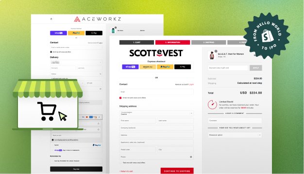
Checkout
The typical checkout procedure looks something like this:
- Cart for purchases.
- Information about billing (optional; varies by merchant).
- Details about shipping (which might be the same as billing).
- Delivery mode.
- Method of payment.
- Verification.
The Bottom Line
To ensure the smooth operation of an eCommerce store, you begin with the necessary pages and setup. Keep testing with your team to determine what works and what doesn’t.
Additionally, confirm that all devices can display your design and that you are prepared for digital interactions via various channels. Conversion statistics, new products, landing pages, and consumer browsing habits will support every web design development.
Consider all the designs we’ve made for our clients by visiting the Paspartoo and looking through our portfolio.

